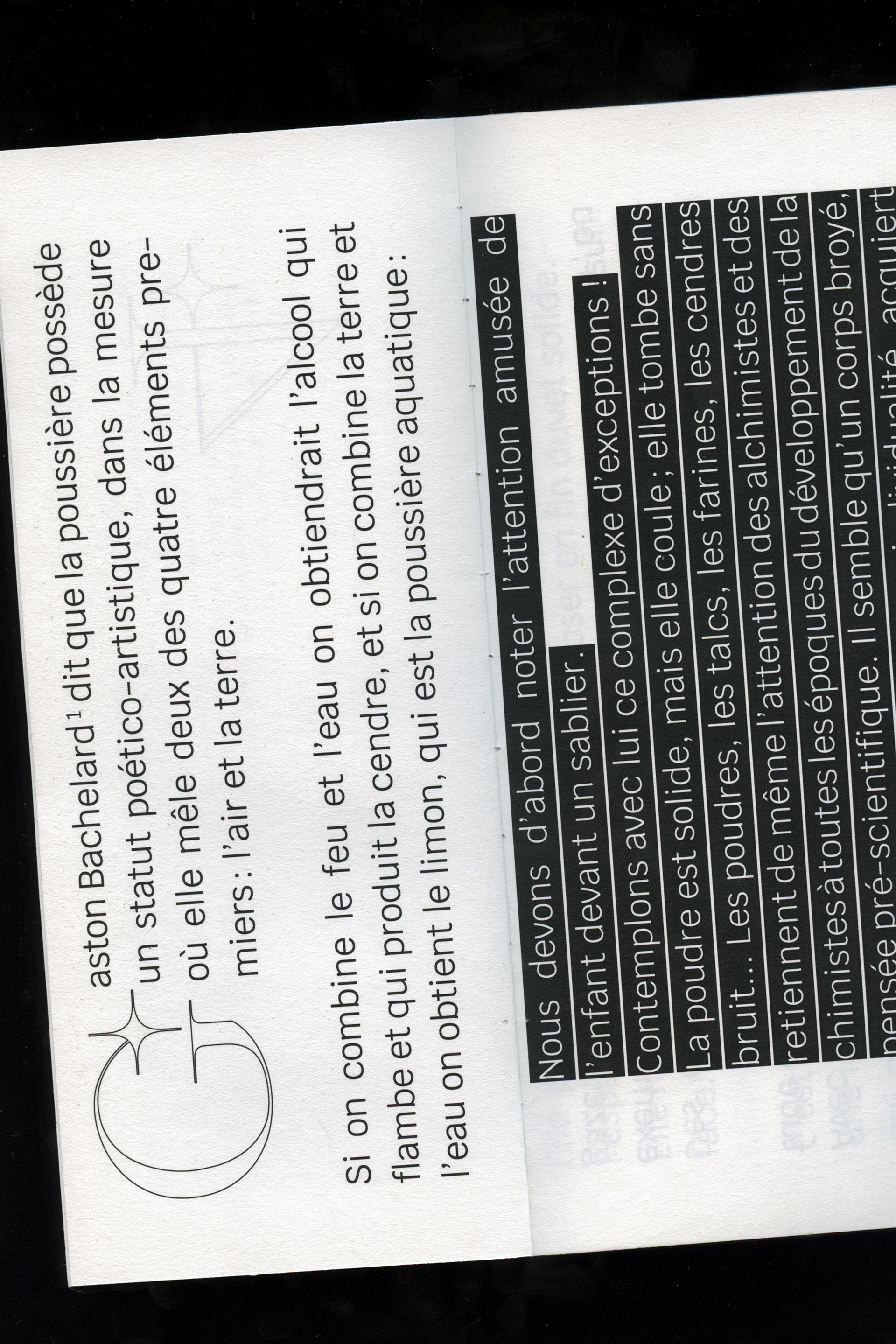
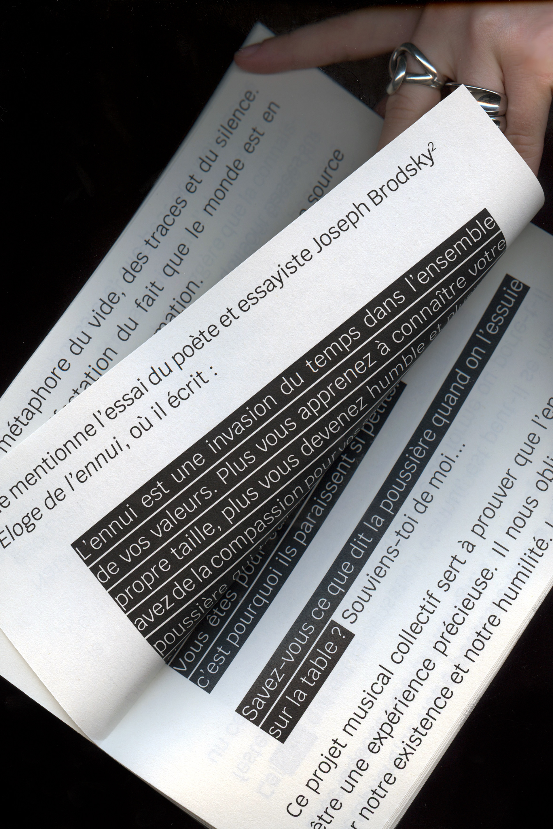
This text is part of my research into the Semipalatinsk nuclear disaster and the lingering legacy of the Soviet regime, which has led me to explore the theme of dust and its significance in the context of environmental and political devastation. Inspired by the philosopher Michael Marder’s reflections on the Chernobyl disaster, I have examined the symbolic and material aspects of dust as a metaphor for the lasting consequences of human actions.
This texts acts as a reminder that the audience, who spends the most time in front of an artwork, are those who take care of them, those who install them, those who preserve them and watch them for entire days.
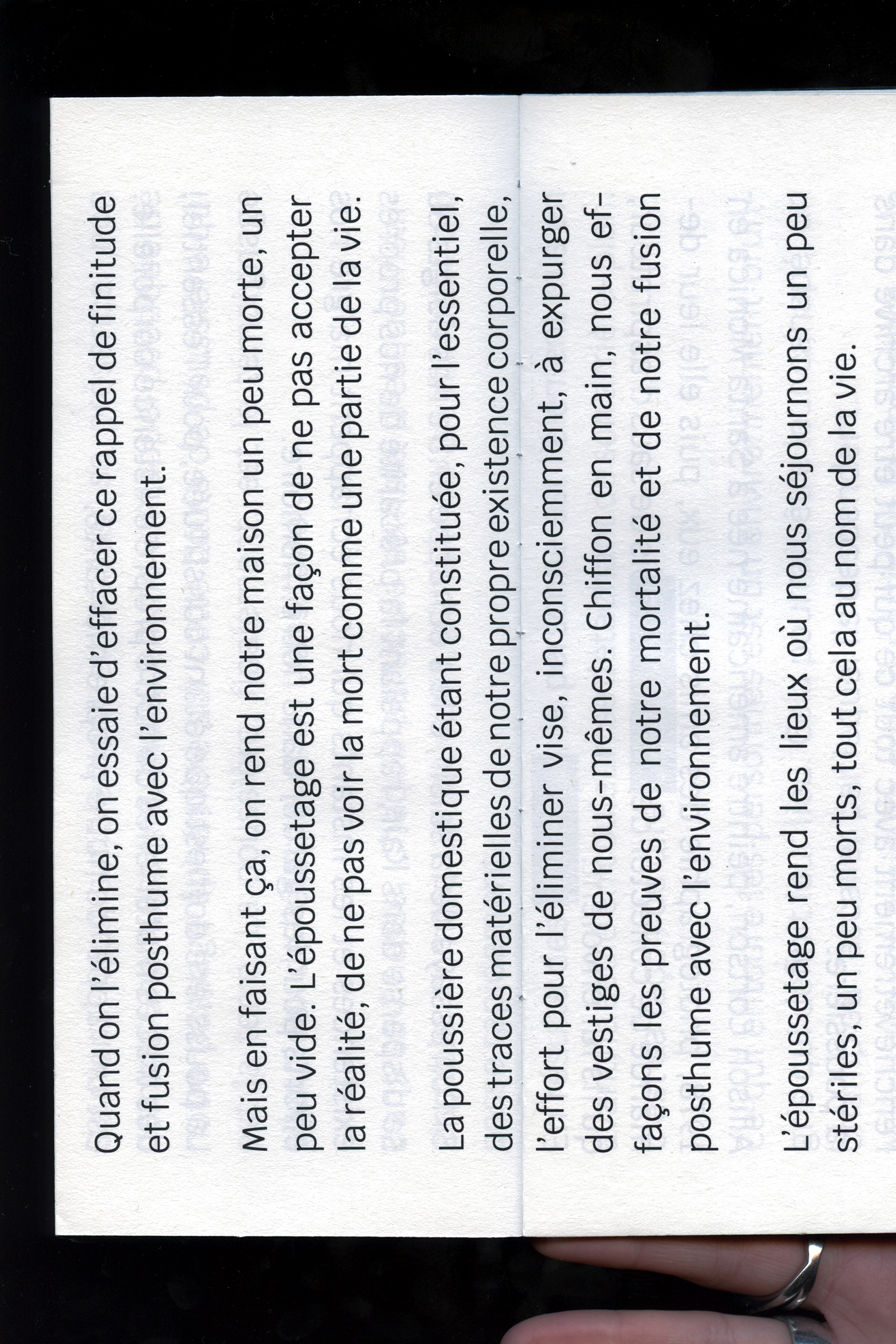
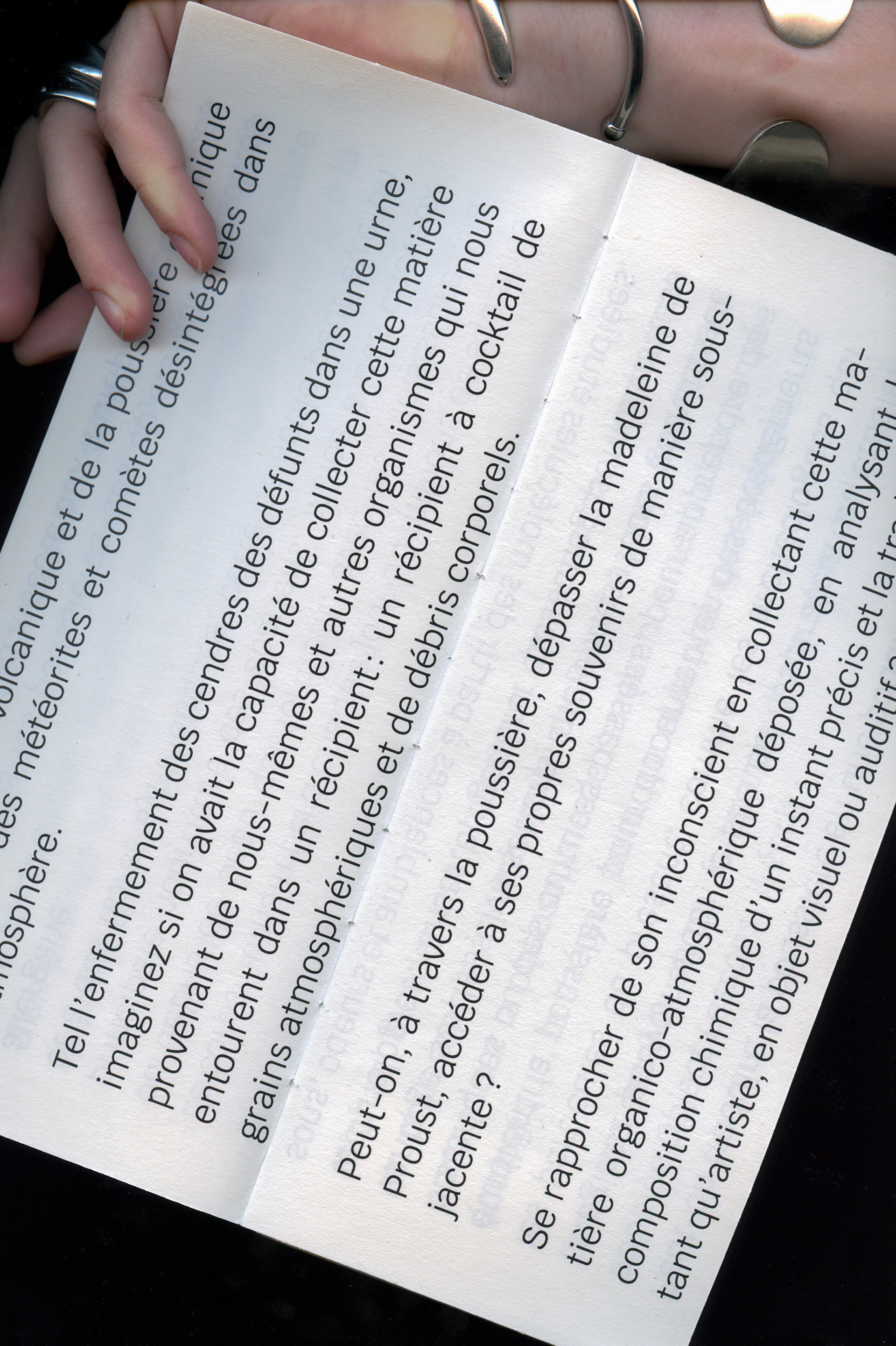
The design is inspired by a publishing house that aimed to make books accessible to those who take public transport during rush hour. So the horizontal format and the imposing font made it possible to scroll through the book with one hand, and facilitate reading during the journey.
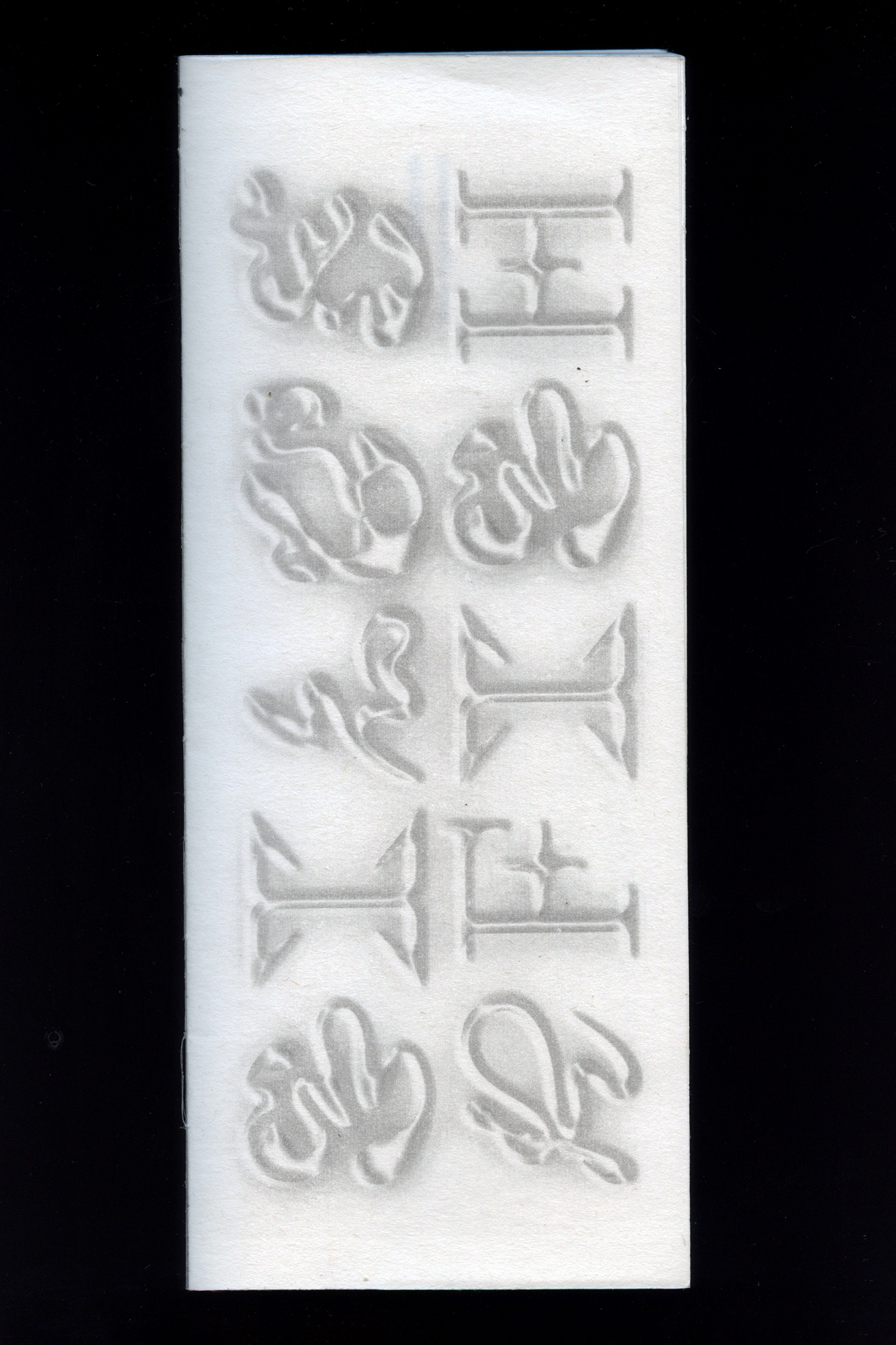
The font I used for the titles is called SAINT and was designed by Liza Dushnota, and it is a hybrid font between the Latin and Cyrillic alphabets allowing variations in the letters. It echoes my art practice and the interest in the traces of the Soviet Union, particularly the Cyrillic alphabet imposed from 1938 to 1989 in Moldova who spoke Romanian and wrote in the Latin alphabet. I have a fascination for people who still use this transliteration system, or who unconsciously leave traces of it in their handwriting.